Selecting the right grout colour is one of the most important steps in any tile installation project. Whether you’re renovating a bathroom, fitting a new kitchen floor, or completing a commercial tiling job, the right tile grout can completely transform the final finish.
Grout colour plays a major role in the overall appearance of porcelain tiles, ceramic tiles, natural stone, mosaics and large-format floor tiles.
The Kerakoll Fugabella Colour collection is a premium decorative resin-cement grout designed for residential and commercial tiling projects across Ireland and the UK. Fugabella Colour combines high-performance durability with a wide range of colours.
Kerakoll Fugabella Colour Chart
Browse the full Kerakoll Fugabella grout colour chart featuring 50 modern grout shades for porcelain tiles, ceramic tiles and natural stone installations.
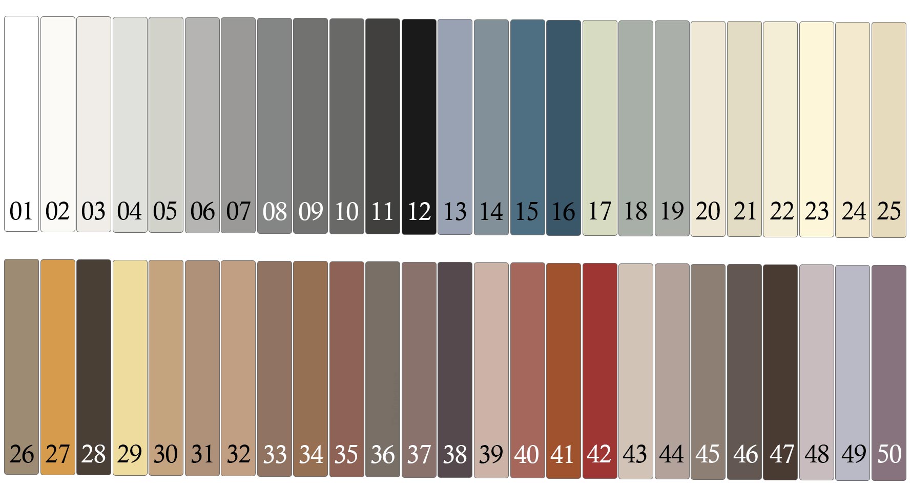
Please Note: Colours shown on-screen are for guidance only. Lighting, tile texture, joint width and curing conditions can influence the final appearance. We recommend testing on a small area completing the full room. If you have a question on shades, contact our showroom today for expert guidance
Why Choose Kerakoll Fugabella Colour Tile Grout?
- With 50 colours to choose from, it's easy to find a great match with the Fugabella range. From soft neutral grout colours and warm beige tones to anthracite, grey, black and bright white tile grout, the range is ideal for both subtle tile blending and high-contrast tile layouts.
- Perfect for every room. From bathroom walls and kitchen splashbacks to wet rooms, showers and feature areas.
- Fugabella creates smooth, dense grout joints that are easier to clean and maintain over time. Its advanced formulation supports a cleaner appearance in busy kitchens, bathrooms, utility rooms and commercial environments
- Fugabella offers superior colour consistency: offers excellent colour uniformity, helping create a premium, professional-quality tiled finish.

How to Choose the Best Grout Colour for Your Tiles
1. Match Your Tile Colour
Choosing a grout colour close to your tile shade creates a seamless tiled surface with reduced grout visibility. This approach is popular in modern Irish and UK bathroom designs, minimalist kitchens and large-format porcelain floor installations.
2. Use Contrasting Grout for Definition
Contrasting tile grout highlights the shape and layout of each tile, making patterns and feature designs stand out. Dark grout with white metro tiles or light grout with dark porcelain tiles are popular interior design trends throughout Ireland and the UK.
3. Neutral Mid-Tone Grout
Mid-tone grout colours such as grey, silver and taupe are often the most practical choice for everyday maintenance.
Tip: Always compare grout samples under your room lighting conditions. Warm indoor lighting can soften grey grout tones, while natural daylight may make white and cream grout colours appear brighter.
Wider grout joints also create a stronger visual effect, so testing grout colour before full installation is always recommended.

Before choosing your grout colour, consider the following:
- Tile finish: Matt, polished and textured tiles can affect how grout colour appears.
- Joint width: Wider grout joints increase colour visibility.
- Room lighting: Check grout shades in both daylight and artificial lighting.
- Test area: Always allow grout to fully cure before assessing the final colour.
- Tile style: Consider whether you want a seamless tile finish or defined grout lines.
Please note that grout colours displayed on-screen are intended as a guide only. Final grout appearance can vary depending on lighting conditions, tile texture, joint width, installation method and curing conditions. For the best results, test a small sample area before completing your full tiling project.
Explore the full range of Kerakoll tile grout products.